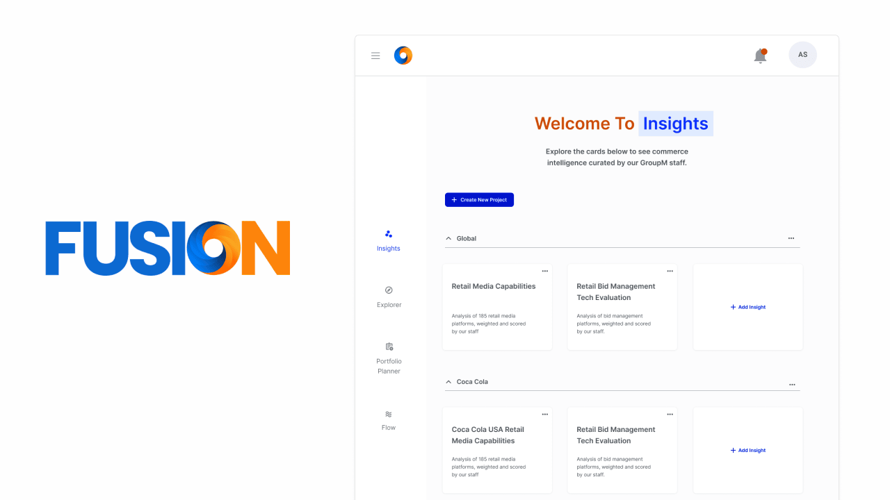
A commerce intelligence dashboard that replaced manual PowerPoint reports — giving three global Fortune 500 CPG brands one live place to evaluate and compare retail media partners across nine channels.
Role
Sole UX/UI Designer
Users
GroupM Commerce
Clients
Fortune 500 CPG brands
Platform
Web App
Impact at a glance
4
Charts, each designed for one specific analytical question
3 → 5+
Retailers comparable at once after the radar-to-heatmap pivot
Pitched
Demoed directly in Fortune 500 client presentations
Client names have been omitted to respect confidentiality agreements.
The problem
Gigabytes of retail data. Zero way to compare it.
GroupM's commerce team was sitting on a massive amount of retail data with no easy way to compare it. Evaluation data came in from multiple retail partners and channels — CTV, search, display, social, and audio — spread across tools like Comscore, SimilarWeb, Criteo, and CitrusAd.
Strategists relied on PowerPoint to manually build charts for every client presentation. Teams spent hours assembling reports instead of doing analysis. Answering a simple question — how does Walmart compare to Kroger across our commerce channels? — meant building a new deck from scratch.
My role
The most client-facing product on the platform.
I was the sole designer throughout — from the first stakeholder session through to user testing and engineering handoff. I owned requirements gathering, charting library research, wireframing, hi-fi design, prototype testing via Maze, and cross-functional negotiation with engineers on chart feasibility.
Of all the Fusion products, Insights carried the most weight. This was what got demoed directly in three global Fortune 500 CPG brands sessions. If the dashboard didn't hold up in a client presentation, everyone knew.
Discovery
Understand the data before designing the charts.
Before sketching a single screen, I needed to understand three things: what data the commerce team was working with, what questions they were trying to answer, and what our charting library could support.
01
Stakeholders
Requirements from the commerce team
Working sessions surfaced two requirements that shaped everything: retailers needed fair comparison groups (pharmacy vs. grocery vs. general), and the dashboard needed to surface both overall performance and channel-level detail.
02
Data audit
Mapping every metric
I mapped every metric that Flow would pipe into Insights: overall retailer scores, per-channel weights across nine channels, monthly traffic, revenue, and growth rate. Chart types had to follow from the data, not the other way around.
03
Charting library
Confirming what engineering could build
Aligning with engineers early on Nivo Rocks meant I wasn't designing charts that couldn't ship. Several decisions later depended directly on knowing the library's constraints upfront.
How Insights works
Flow feeds Insights — the two platforms work in tandem.
Insights didn't exist in isolation. The data powering every chart came from Flow — completed RFI evaluations that had been scored, approved, and published. Every insight was grounded in real retailer response data. Setting up a new Insight was a three-step process in Admin Mode.
01
Name
Give the Insight a name
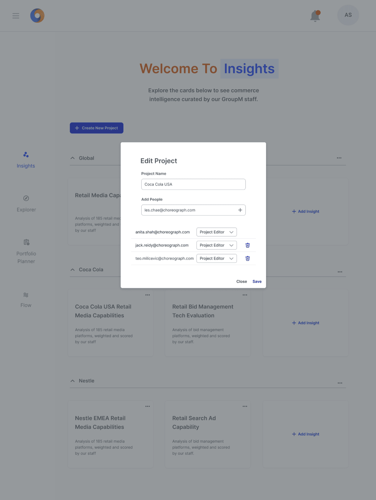
Name the Insight to map to the evaluation — e.g. "Brand Client USA Retail Media Capabilities." Keeps dashboards organized across multiple brand clients.
02
Attach Flow
Connect a completed Flow
Connect a completed, published Flow — this is the data source that powers the dashboard. All scores, channel weights, and retailer data flow in automatically.
03
Weigh Segments
Set channel weights per segment
Set channel weights for each retailer segment — General, Grocery, Pharmacy, Pure Pay. Different segments can have different weightings, making scores more meaningful and client-defensible.
The dashboard
Four charts. Four analytical questions. One page.
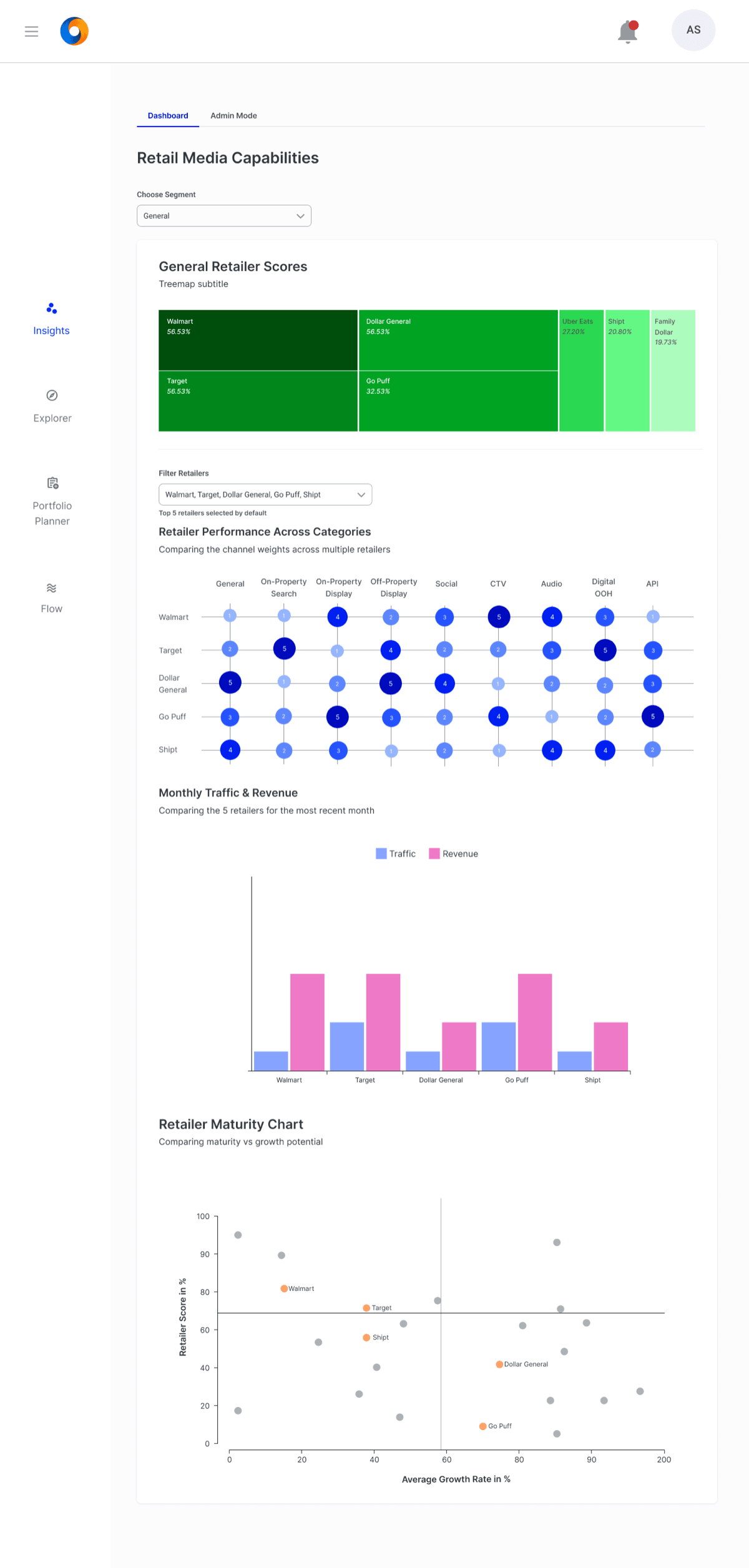
The commerce team didn't have one question about their retailers — they had four. Each chart was designed to answer exactly one. Click each to expand.
Chart 01
Treemap
Who is leading and who is lagging?
+
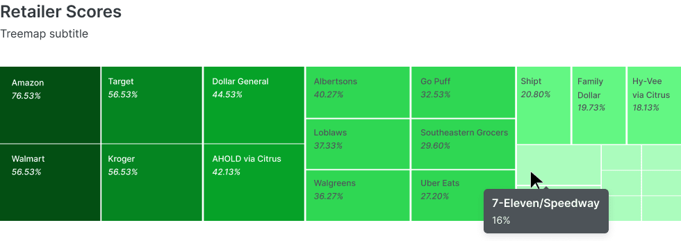
Each retailer appears as a tile sized by overall score and colored on a dark-to-light green scale. This chart almost didn't ship — engineers worried lower-performing retailers would appear nearly invisible. I went back with research, argued the case, and it shipped. The smaller tiles weren't a flaw; they accurately reflected each retailer's footprint in the data.
Chart 02
Radar → Bubble Heatmap
How do retailers compare across channels?
+
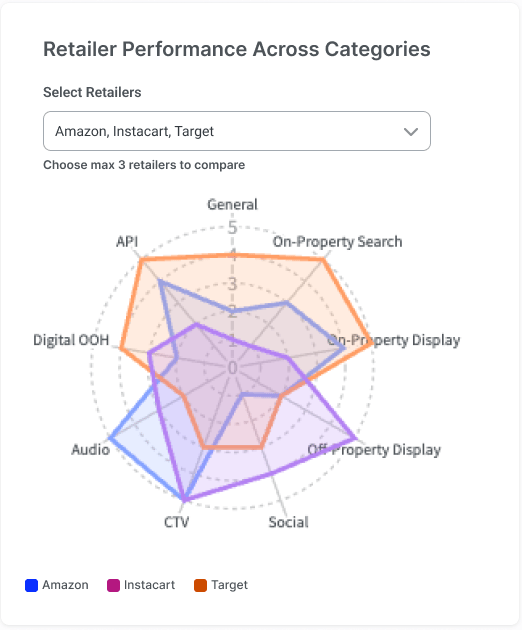
Originally a radar chart — nine axes, each retailer as a filled polygon. User testing surfaced the problem: strategists needed to compare five or more retailers simultaneously, where overlapping polygons become unreadable.
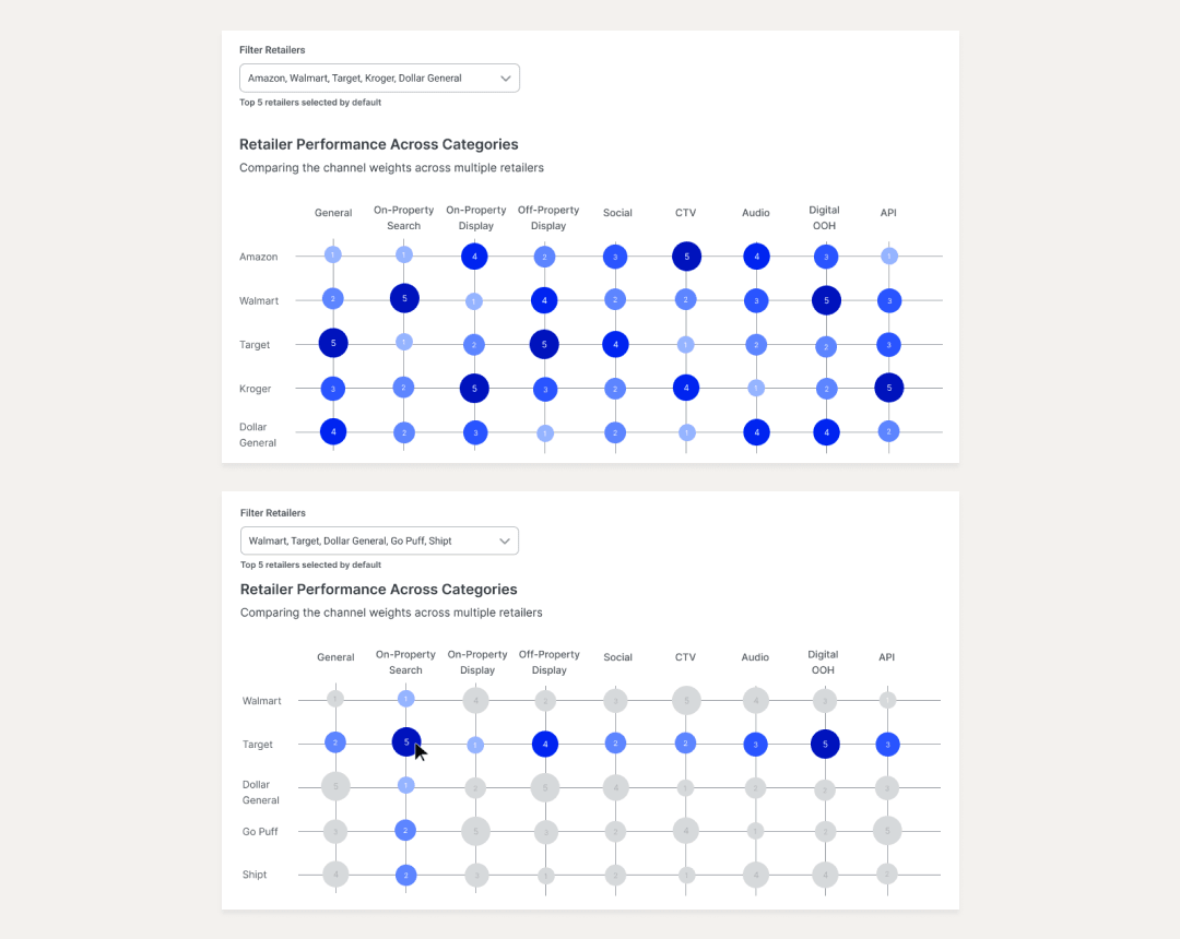
The pivot: a bubble heatmap where retailers are rows, channels are columns, and each cell is a bubble sized and colored by score intensity. Hovering highlights the entire row and column. The commerce team's reaction was immediate.
Chart 03
Bar Chart
How does traffic and revenue track month over month?
+
Monthly traffic and revenue trends in a grouped bar chart — giving strategists a temporal view to complement the treemap and heatmap. Answers not just where retailers stand, but how they've been moving.
Chart 04
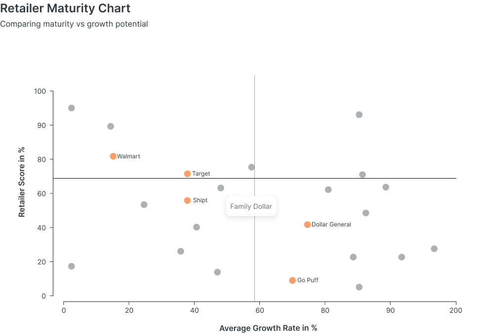
Retailer Maturity Scatter Plot
Where should a brand invest next?
+
Maps Retailer Score on the Y-axis against Average Growth Rate on the X-axis. Four quadrants tell a clear strategic story: priority partners, emerging opportunities, established but plateauing, and deprioritized. This chart ended up front and center in Fortune 500 client pitches — it translated raw scores into business strategy in a way raw numbers couldn't.
User testing
Maze prototype testing with the commerce team.
Testing covered the full admin flow and the dashboard experience. The radar-to-heatmap pivot was the most significant finding — but testing also revealed that strategists needed to create and name their own segments rather than working with a fixed taxonomy. The Manage Segments modal was a direct result.
Maze — Prototype Test Results
8 Testers · Commerce Team
Participants
8
Tasks
3
Avg Completion
79%
Avg Time on Task
1m 42s
Task 01
Set up a new project in admin and publish it to a client
Create a custom segment and assign retailers to it
50%
completion
⏱ 1m 44s avg↩ 3.5 misclicks avgGap: no way to name segments → Manage Segments modal added
→
Radar chart failed at scale. 5+ retailers made it unreadable — led directly to the heatmap redesign.
→
Segments needed naming. Fixed taxonomy didn't fit strategist workflows — the Manage Segments modal was scoped as a result.
Original — Radar chart
Max 3 retailers at once
Nine axes, each retailer as a polygon. Clear up to 3 — but strategists regularly needed 5+, where shapes overlapped into unreadable noise.
After testing — Bubble heatmap
Handles 5+ with ease
Grid: retailers as rows, channels as columns. Bubble size and color encode score. Hover highlights the full row and column for focused comparison.
✓ Shipped
Reflections
What this project taught me.
Data viz is a research discipline
Every chart started with a question — what is the user actually trying to understand? Working backwards from that saved enormous time and avoided charts that looked good but answered the wrong question.
Defend decisions with evidence
The treemap pushback wasn't comfortable. Going back with research rather than capitulating gave me a framework I've used in every design conversation since.
What I'd add with more time
A presentation mode — full-screen, no UI chrome, chart-first. The commerce team frequently presented from laptops and the dashboard wasn't optimized for that context.
Flow + Insights together
Insights proved the value of the broader Fusion platform. Flow collected the data. Insights made it meaningful. Together, they gave GroupM a single source of truth for retail media evaluation.