Website Design
UX Strategy
Visual Design
Dev QA
SRA Website
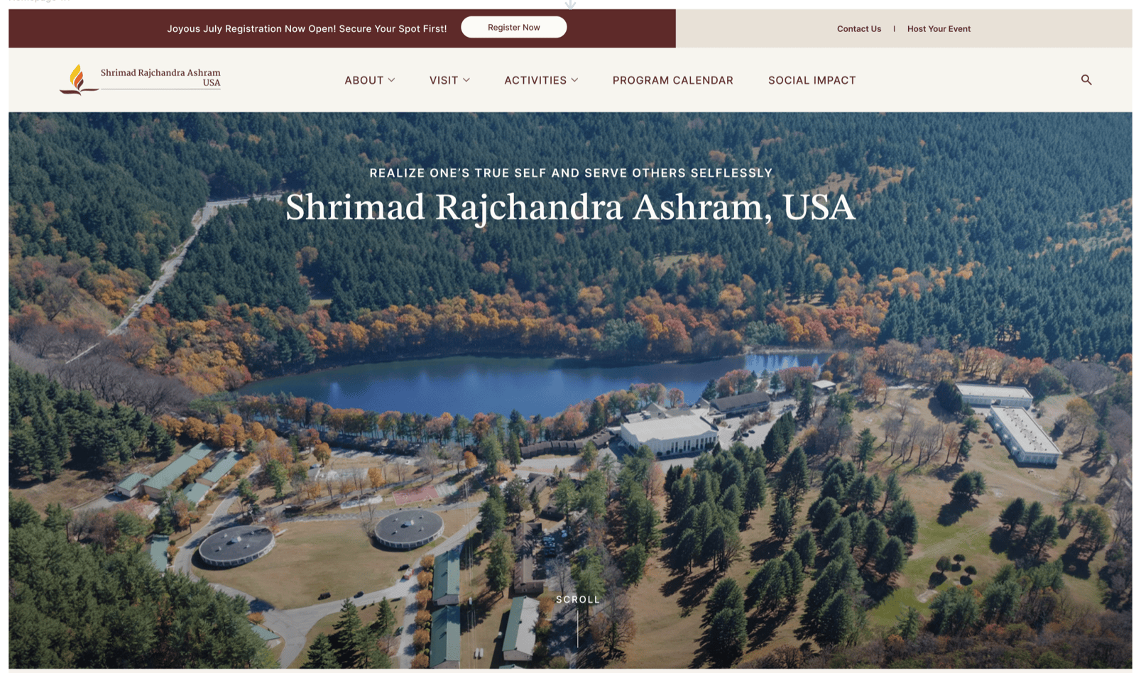
A 16-page website for Shrimad Rajchandra Ashram, USA, an upcoming wellness sanctuary in the Poconos designed to offer a space for reflection, learning, community, and inner growth. Designed from scratch as Lead Designer across strategy, IA, visual design, content collaboration, and development QA.
Role
Lead UX/UI Designer (Freelance)
Outcomes
Dev-ready
Complete Figma handoff — specs, components, and responsive behavior documented across all 16 pages
6 → 1
Six distinct audience groups unified under a single brand voice and IA strategy
0 → 16
No existing brand, site, or digital strategy — to a fully designed, QA-reviewed 16-page site
The site launched in July 2026 at srausa.org. What exists now is a full digital foundation the organization didn't have before: a scalable IA, a cohesive visual system, and a handoff-ready Figma file that gave the development team everything they needed to build.
The harder outcome was strategic. The Ashram had no established U.S. brand voice, no precedent for what the site should feel like, and a content team building pages in parallel with design. Resolving that ambiguity — establishing visual and structural patterns early enough that content and design could evolve together — is what made the project work.
The challenge
Designing a website for a place that was still coming to life.
The Ashram is a new physical destination, no existing website, no established digital presence. The organization needed a site that could introduce the Ashram to first-time visitors, communicate its history and offerings, support visitor planning, and create a scalable foundation for future growth, all before the space had physically opened.
The project had to balance multiple needs at once: introduce a new wellness sanctuary, honor the heritage of the mother Ashram in India, create a brand experience relevant to a U.S. audience, support both first-time visitors and existing members, and launch 16 pages from scratch.
The website could not simply be informational. It needed to feel immersive, welcoming, and emotionally connected to the physical space.
"The design needed to feel like an invitation. When users landed on the site, we wanted them to feel: I want to come here."
My role
Leading design from strategy through QA.
I served as Lead Designer throughout the project. While there was a broader team involved, most of the design direction and execution fell under my ownership. I was responsible for co-owning the information architecture with the content team, creating wireframes for key pages, leading the visual design direction, and translating content into clear, engaging page experiences.
I also worked directly with the development agency, explaining design intent, reviewing the implemented site, and providing ongoing QA feedback across button states, font styling, spacing, responsive behavior, and layout edge cases. A major part of my role was making sure content and design evolved together, since the two could not be separated on a project this storytelling-heavy.
Audience
Six distinct groups. One coherent experience.
The website was designed for several key audience groups, each arriving with different needs, motivations, and levels of familiarity with the Ashram. The goal was for every visitor to land on the site and feel drawn to the space, to see it as beautiful, meaningful, welcoming, and worth visiting.
First-time visitors discovering the Ashram
Spiritual seekers looking for reflection or growth
Current members of the organization
Retreat attendees and program participants
Visitors interested in yoga, meditation & sound healing
Visitors planning a trip to the Poconos location
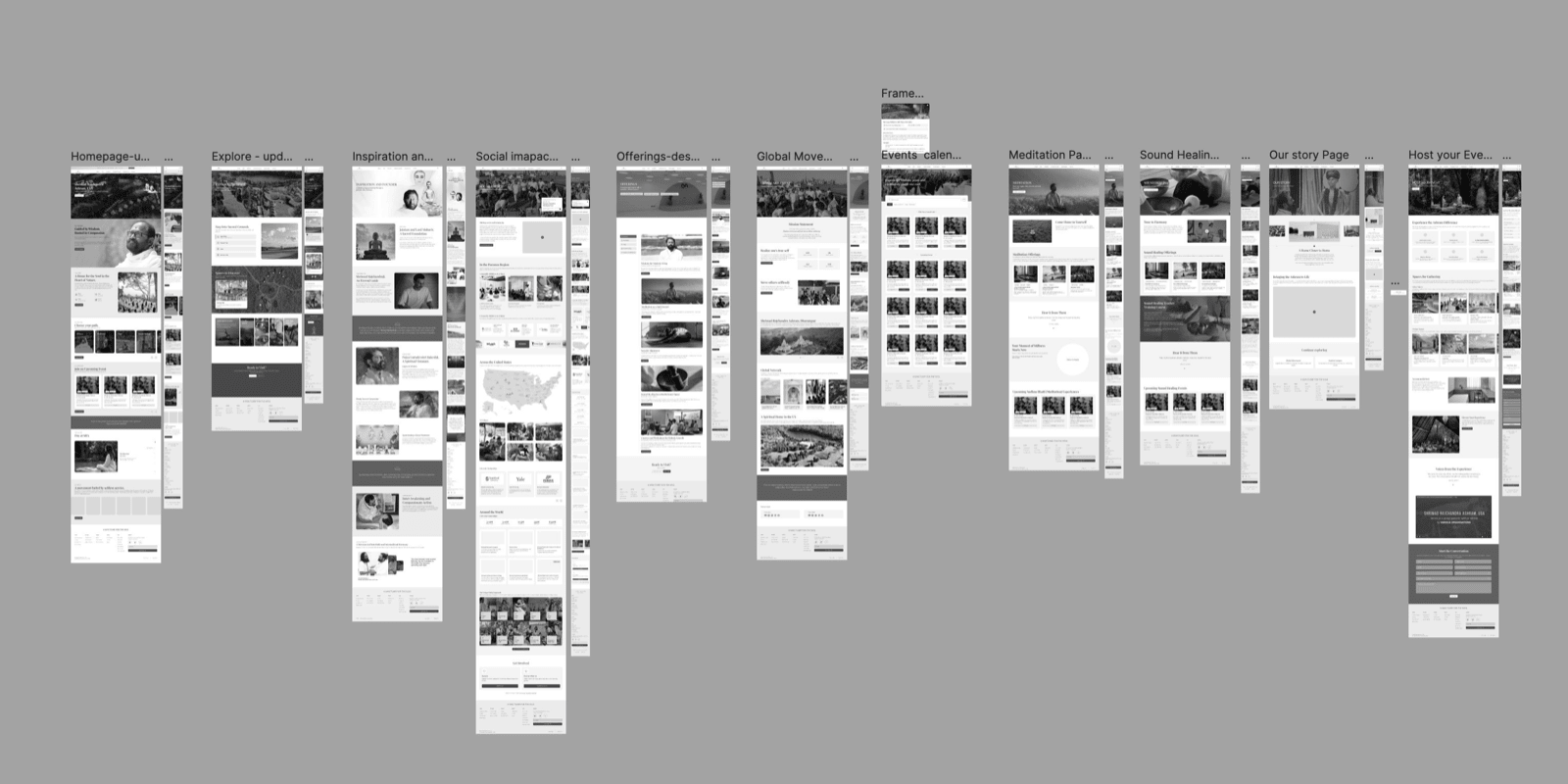
The 16-page launch scope covers:
Homepage
Inspiration & Founder
Our Story
Explore the Space
Global Headquarters
Social Impact
Programs Calendar
Host Your Event
Contact Us
Directions
Yoga
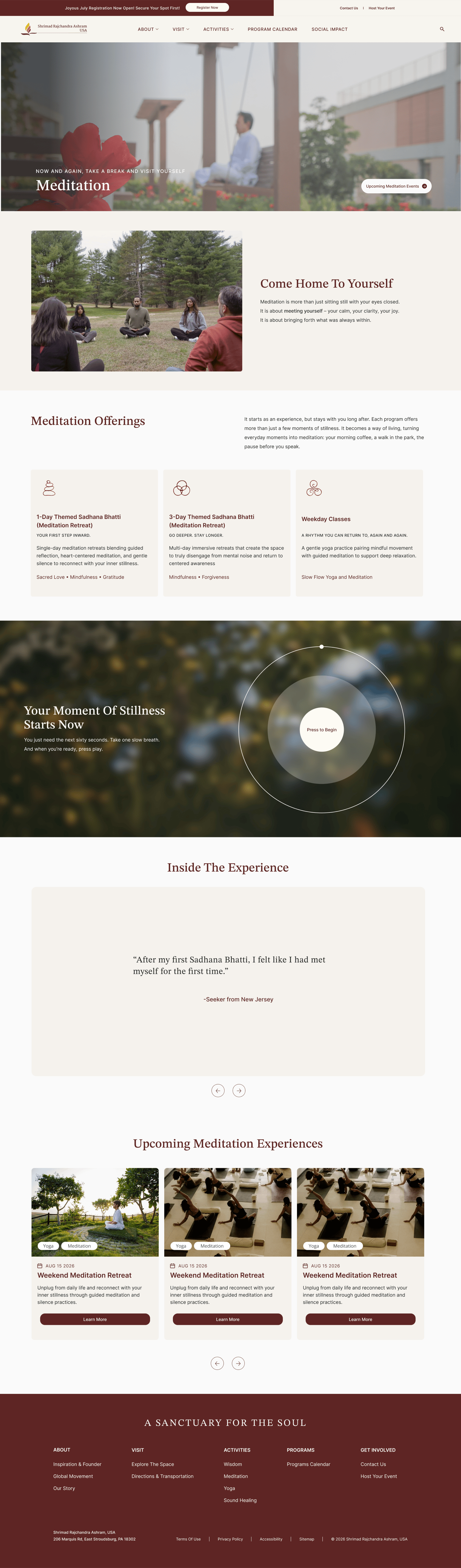
Meditation
Sound Healing
Courses
UX approach
Storytelling as the core design strategy.
One of the biggest design decisions was making storytelling central to the experience. Rather than treating each page as a static information page, I designed the site to guide users through the Ashram's space, history, culture, and offerings in a more immersive way, through page structure, section pacing, photography, quotes, audio moments, and a layered content hierarchy.
The goal was to help users feel like they were beginning to experience the Ashram before physically arriving.
01
Honor heritage, increase accessibility
The Ashram has deep roots connected to the mother organization in India. The design respected that heritage without feeling inaccessible to a U.S. audience, rooted, but approachable.
02
Make content-heavy pages digestible
Pages like Social Impact and Our Story needed to communicate history, philosophy, and impact without overwhelming users. Strong visual hierarchy, section pacing, and visual pauses made dense content feel scannable and emotionally engaging.
03
Build for scalability from day one
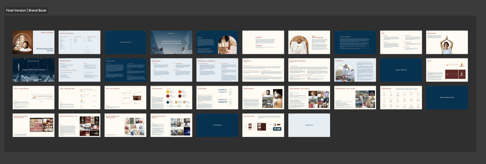
The site structure, page templates, and design patterns were created to support future content, programs, events, and visitor resources, because the first launch is only the beginning of a larger digital ecosystem.
Key design decisions
Three choices that shaped the experience.
01
Creating an immersive first impression
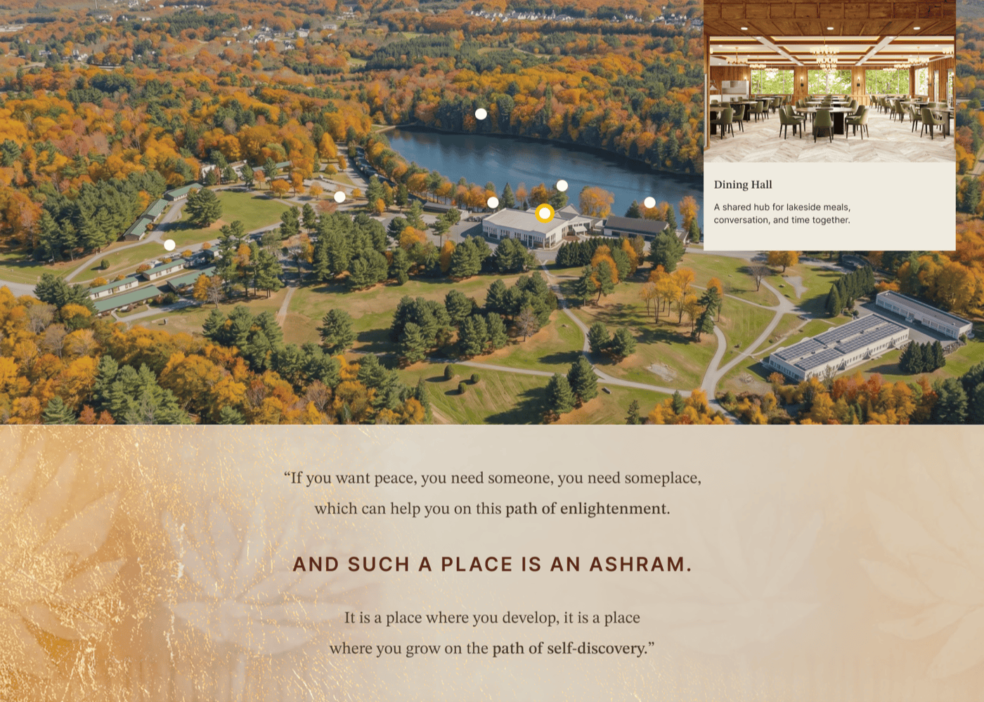
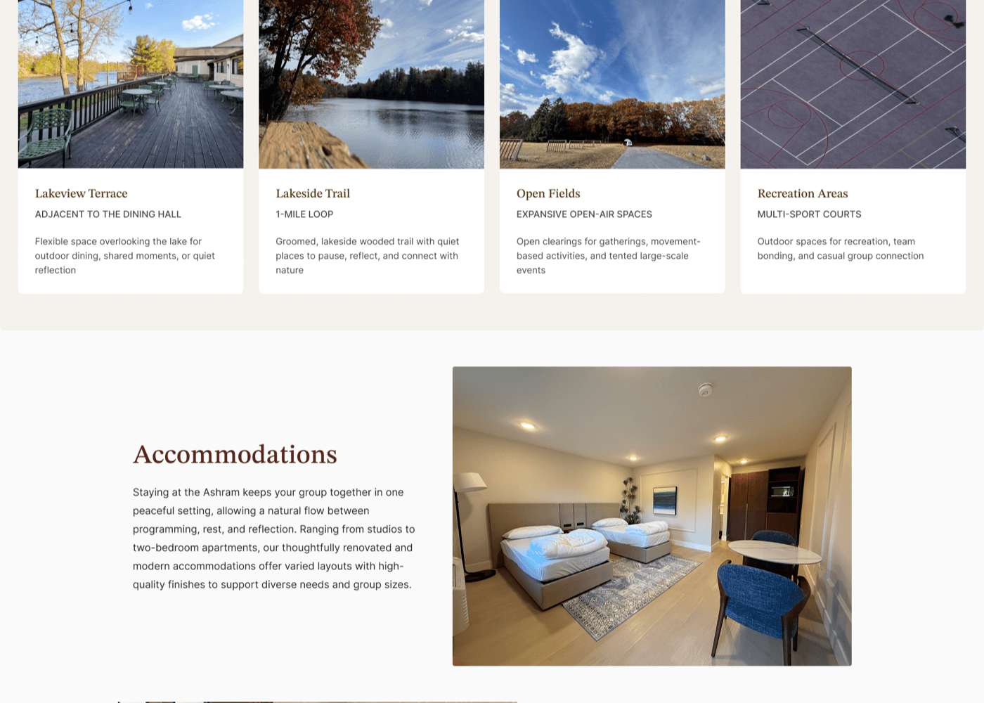
For the homepage and key storytelling pages, I designed for users to immediately feel the beauty and scale of the Ashram, using imagery, spacious layouts, and thoughtful pacing to create a sense of arrival. The goal was to make the user feel invited into the space.
02
Weaving quotes throughout the experience
Quotes from the spiritual guru became a key design element across the site, bringing the spiritual foundation into the experience in a subtle, meaningful way without over-explaining the philosophy. In some areas, quotes were paired with audio, creating a more immersive and sensory moment.
03
Designing program pages as individual experiences
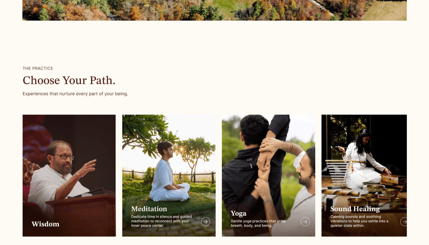
Each offering (yoga, meditation, sound healing, courses) needed its own page, but also had to feel cohesive across the site. I approached these as part of a larger content system: each page explains the offering clearly while staying connected to the broader purpose of the sanctuary.
Design evolution
Homepage: from structure to final.
The homepage went through three meaningful stages. The wireframe established content hierarchy and section order without committing to any visual style. V1 explored a darker, typographic-led direction — clean and contemporary, but it read more like a boutique hotel than a spiritual sanctuary. The final shifted to a warmer, photography-forward experience built around immersion and arrival.
The key decision moment: V1 had strong structure but felt emotionally cold. The shift to warm tones, aerial photography, and a floating Guruji portrait was what made the homepage feel like an invitation rather than an introduction.
Wireframe
Structure and content hierarchy first. Section order, navigation pattern, and key messaging blocks established before any visual direction was decided.
→
V1
First full visual direction — dark, minimal, typographic-led. The layout logic was right, but the emotional tone was off. It felt corporate, not contemplative.
→
Final
Warm, photography-forward, immersive. Aerial imagery, the Guruji portrait, lake panorama, and measured section pacing create a sense of arrival before the user steps foot on site.
Collaboration
Content and design developed together.
I worked closely with the content team throughout the project because the two disciplines couldn't be separated. Together we worked through questions like: what does a first-time visitor need to understand first? Where does the story need more emotion? What should be shown visually instead of explained in text?
This content-design partnership was especially important for pages like Our Story, Social Impact, and Inspiration & Founder, pages where the experience only works when structure, visuals, and messaging are developed together.
Once the site moved into development, my focus shifted to protecting the overall experience rather than chasing pixel perfection. QA feedback covered button states, font styling, spacing, padding, responsive behavior, layout edge cases, and component consistency. That collaboration carried the site through to its July 2026 launch.
Reflections
What this project taught me.
Content design is UX
This project made clearer than any other that content strategy and UX are the same discipline. IA, copy decisions, and page layouts were inseparable. You couldn't design one without the other.
Designing for a vision, not a reality
With no photography and no open physical space, the design had to create belief in something that didn't yet exist. Every visual and content decision carried more weight than usual.
Leading across the full lifecycle
This was one of the first projects where I owned strategy, UX, visual design, content collaboration, and development QA simultaneously. It shaped how I think about what it means to lead design end-to-end.